Discover the Different White RAL Colors for Spray Paint

Spray émail blanc Belton pour une finition lisse et brillante.

White is a versatile color that adds freshness, purity and space to any environment.
In the world of spray paint, RAL colors are an indispensable standard, loved for their consistency and reliability.
With a wide range of white RAL shades, choosing the right color for your project can be a challenge.
In this blog, we’ll dive into the various white RAL colors, their unique properties and similarities.
Not only will this help you make the right color choice, but it will also ensure that your shop is better found on search terms with RAL color codes.

The Meaning of White in Designs

White is often associated with purity, simplicity and space.
It can make a room appear larger and lighter and create a sense of calm and serenity.
White is a timeless color that can be used in a variety of styles and environments, from modern to classic.

Overview of White RAL Colors

Here are some of the most popular white RAL colors you can find in our range of spray paint:

RAL 1013: Pearl white

RAL 1013, Pearl White, is a soft and subtle shade of white with a hint of cream.
This color exudes a sense of warmth and comfort, ideal for residential and commercial environments where a soft look is desired.

RAL 9001: Creamy white

RAL 9001, Cream White, has a light, creamy hue that adds warmth and coziness to any room.
This color is perfect for both interior and exterior applications, especially in classic and traditional designs.

RAL 9002: Gray-white

RAL 9002, Gray White, is a neutral shade of white with a touch of gray.
This color exudes a sense of coolness and modernity, ideal for industrial and minimalist designs.

RAL 9003: Signal white

RAL 9003, Signal White, is a bright and pure white with no undertones.
This color exudes freshness and purity and is perfect for use in modern and sleek interiors and exteriors.

RAL 9010: Pure white

RAL 9010, Pure White, is a classic shade of white that is just slightly warmer than Signal White.
This color exudes a sense of purity and elegance, ideal for use in both residential and commercial settings.

RAL 9016: Traffic white

RAL 9016, Traffic White, is a neutral and bright shade of white often used for traffic and safety purposes.
This color is also suitable for various decorative applications thanks to its versatile and neutral appearance.

RAL 9018: Papyrus White

RAL 9018, Papyrus White, has a slight gray undertone that gives a subtle and sophisticated look.
This color is perfect for modern and contemporary designs where a softer shade of white is desired.

Similarities and Differences

Although all of the above RAL colors are in the white spectrum, they each have their unique characteristics that make them suitable for different applications.
Here are some similarities and differences that can help you make the right choice:

Similarities and Differences

Although all of the above RAL colors are in the gray spectrum, they each have their unique characteristics that make them suitable for different applications.
Here are some similarities and differences that can help you make the right choice:

Agreements:

  • Freshness: All white RAL colors exude a sense of freshness and purity.
  • Versatility: These colors can be used in a variety of environments, from modern interiors to traditional exteriors.
  • Consistency: RAL colors are known for their consistency, which means you will always get the same color regardless of the batch.

Differences:

  • Hue: Some colors have cream, gray or subtle undertones, while others are pure white with no undertones.
  • Scope: Creamy white and gray-white tones are often used for classic and traditional designs, while pure white tones are ideal for modern and sleek interiors.
  • Appearance: Neutral shades such as RAL 9016 (Traffic White) can create a sense of versatility and neutrality, while warmer shades such as RAL 9001 (Cream White) convey a sense of warmth and coziness.

How to Choose the Right White RAL Color

When choosing the right white RAL color for your project, it is important to consider the purpose of the color and the environment in which it will be used. Here are some tips to help you choose:

  1. Identify Purpose: Determine whether the color should be decorative or functional. For subtle and sophisticated designs, colors such as RAL 9018 (Papyrus White) and RAL 9002 (Gray White) are suitable, while pure white tones such as RAL 9003 (Signal White) are ideal for fresh and clean effects.
  2. Consider the Environment: Consider the environment in which the color will be used. Creamy white and gray-white shades are perfect for classic and traditional environments, while pure white shades are suitable for both indoor and outdoor applications.
  3. Test the Color: If possible, test a small amount of the chosen color on the intended surface to see how the color looks under different lighting conditions and in combination with other elements in the room.

Conclusion

White RAL colors offer a wide range of possibilities for different applications, from modern interiors to traditional exteriors. By understanding the unique characteristics of each hue and considering the specific needs of your project, you can choose the perfect white RAL color that brings your vision to life. Visit our webshop for a wide selection of spray paint cans in all available RAL colors and be inspired by the versatility and beauty of white.

Discover the Different Gray RAL Colors for Spray Paint

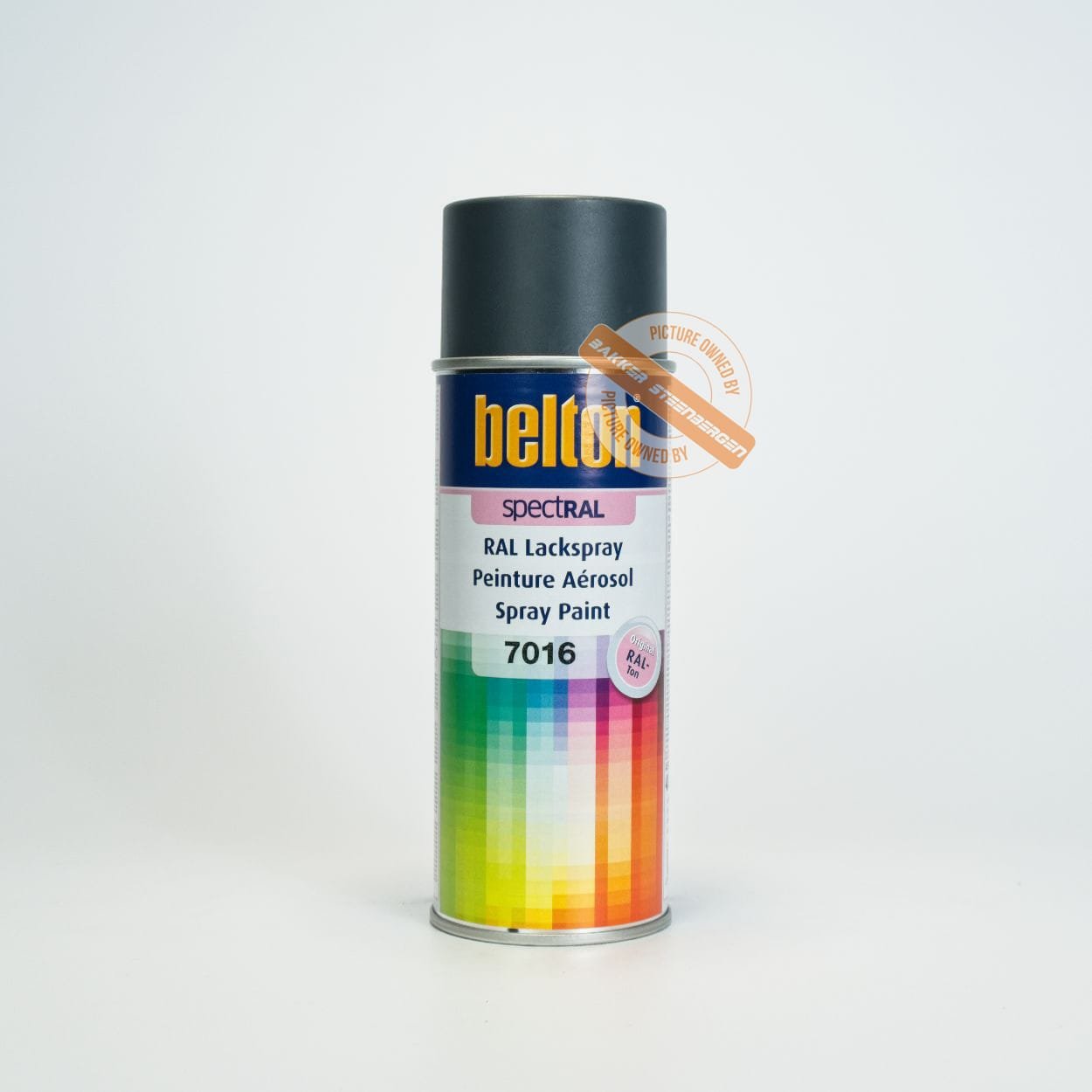
Belton RAL Colors Silk Gloss RAL 7016

Gray colors exude timeless elegance, neutrality and sophistication.
In the world of spray paint, RAL colors are a standard and are often chosen for their consistency and reliability.
However, with so many different gray RAL shades available, it can be confusing to choose the right one for your project.
In this blog, we will explore the different gray RAL colors, explain their unique characteristics and discuss similarities between them.
This will not only help you choose the perfect color, but also ensure that your shop will be better found on search terms with RAL color codes.

The Meaning of Gray in Designs

Before we delve deeper into the specific RAL colors, it is important to understand why gray is such a powerful color in design and decoration.
Gray is often associated with balance, neutrality and sophistication.
It can give a space a modern, industrial look while creating a calm and serene atmosphere.
Gray is also an excellent background color because it makes other colors stand out without being overpowering itself.

Overview of Gray RAL Colors

Here are some of the most popular gray RAL colors you can find in our range of spray paint:

RAL 7000: Fehgrau

RAL 7001, Silbergrau, is a light and bright shade of gray reminiscent of the color of silver.
This color exudes modernity and freshness and is perfect for use in modern interiors and exteriors.

RAL 7001: Silbergrau

RAL 7001, Silbergrau, is a light and bright shade of gray reminiscent of the color of silver.
This color exudes modernity and freshness and is perfect for use in modern interiors and exteriors.

RAL 7003: Moosgrau

RAL 7003, Moosgrau, is an earthy and subtle shade of gray with green undertones.
This color exudes a sense of naturalness and tranquility and is ideal for use in natural and rustic designs.

RAL 7004: signal gray

RAL 7004, Signalgrau, is a bright and neutral shade of gray often used for traffic signs and signage purposes.
This color provides maximum visibility and safety.

RAL 7005: Mouse gray

RAL 7005, Mausgrau, is a dark and tough shade of gray reminiscent of the color of mice.
This color exudes strength and durability and is perfect for use in industrial applications.

RAL 7006: Beige gray

RAL 7006, Beigegrau, is a warm and earthy shade of gray with beige undertones.
This color exudes a sense of naturalness and tranquility and is ideal for use in both residential and commercial applications.

RAL 7011: Eisengrau

RAL 7011, Eisengrau, is a deep and dark shade of gray reminiscent of the color of iron.
This color exudes strength and durability and is perfect for use in industrial and architectural designs.

RAL 7012: Basalt gray

RAL 7012, Basaltgrau, is a bold and subtle shade of gray reminiscent of the color of basalt.
This color exudes a sense of strength and durability and is ideal for use in both residential and commercial applications.

RAL 7015: Schiefergrau

RAL 7015, Schiefergrau, is a deep and rich shade of gray reminiscent of the color of slate.
This color exudes a sense of elegance and sophistication and is perfect for use in chic and modern designs.

RAL 7016: Anthrazitgrau

RAL 7016, Anthrazitgrau, is a very dark and intense shade of gray that appears almost black.
This color exudes a sense of mystery and elegance and is perfect for use in modern and chic interiors.

RAL 7021: Schwarzgrau

RAL 7021, Schwarzgrau, is a deep and dark shade of gray that appears almost black.
This color exudes a sense of strength and durability and is ideal for use in industrial and architectural designs.

RAL 7022: Umbragrau

RAL 7022, Umbragrau, is a warm and earthy shade of gray with brown undertones.
This color exudes a sense of naturalness and tranquility and is perfect for use in natural and rustic designs.

RAL 7023: Betongrau

RAL 7023, Betongrau, is a subtle and neutral shade of gray reminiscent of the color of concrete.
This color exudes a sense of modernity and durability and is ideal for use in both residential and commercial applications.

RAL 7024: Graphitgrau

RAL 7024, Graphitgrau, is a deep and dark shade of gray reminiscent of the color of graphite.
This color exudes strength and elegance and is perfect for use in modern and chic designs.

RAL 7026: Granitgrau

RAL 7026, Granitgrau, is a bold and subtle shade of gray reminiscent of the color of granite.
This color exudes a sense of strength and durability and is ideal for use in both residential and commercial applications.

RAL 7031: Blaugrau

RAL 7031, Blaugrau, is a subtle and neutral shade of gray with blue undertones.
This color exudes a sense of calm and serenity and is perfect for use in both decorative and industrial applications.

RAL 7032: Kieselgrau

RAL 7032, Kieselgrau, is a soft and subtle shade of gray reminiscent of the color of pebbles.
This color exudes a sense of naturalness and tranquility and is ideal for use in natural and rustic designs.

RAL 7034: Gelbgrau

RAL 7034, Gelbgrau, is a warm and earthy shade of gray with yellow undertones.
This color exudes a sense of naturalness and tranquility and is perfect for use in both residential and commercial applications.

RAL 7035: Light gray

RAL 7035, Lichtgrau, is a bright and light shade of gray that exudes a sense of freshness and modernity.
This color is ideal for use in both decorative and industrial applications.

RAL 7036: Platengrau

RAL 7036, Platengrau, is a subtle and neutral shade of gray reminiscent of the color of platinum.
This color exudes a sense of elegance and sophistication and is perfect for use in chic and modern designs.

RAL 7037: Staubgrau

RAL 7037, Staubgrau, is a dark and tough shade of gray reminiscent of the color of fabric.
This color exudes strength and durability and is ideal for use in industrial applications.

RAL 7038: Achatgrau

RAL 7038, Achatgrau, is a soft and subtle shade of gray that exudes a sense of calm and serenity.
This color is perfect for use in soothing and relaxing interior designs.

RAL 7039: Quarzgrau

RAL 7039, Quarzgrau, is an earthy and subtle shade of gray reminiscent of the color of quartz.
This color exudes a sense of naturalness and tranquility and is ideal for use in natural and rustic designs.

RAL 7040: Window gray

RAL 7040, Fenstergrau, is a bright and light shade of gray often used for window frames.
This color exudes modernity and freshness and is perfect for use in both residential and commercial applications.

RAL 7042: Verkehrsgrau A

RAL 7042, Verkehrsgrau A, is a subtle and neutral shade of gray often used for traffic signs and signage purposes.
This color offers maximum visibility and safety.

RAL 7043: Verkehrsgrau B

RAL 7043, Verkehrsgrau B, is a dark and tough shade of gray that is also often used for traffic signs and signage purposes.
This color offers maximum visibility and safety.

RAL 7044: Seidengrau

RAL 7044, Seidengrau, is a soft and subtle shade of gray that exudes a sense of calm and serenity.
This color is perfect for use in soothing and relaxing interior designs.

RAL 7045: Telegrau 1

RAL 7045, Telegrau 1, is a clear and light shade of gray often used for telecommunications equipment. This color exudes modernity and freshness and is ideal for use in both residential and commercial applications.

RAL 7046: Telegrau 2

RAL 7046, Telegrau 2, is a dark and tough shade of gray that is also often used for telecommunications equipment. This color exudes strength and durability and is perfect for use in industrial applications.

Similarities and Differences

Although all of the above RAL colors are in the gray spectrum, they each have their unique characteristics that make them suitable for different applications. Here are some similarities and differences that can help you make the right choice:

Agreements:

  • Neutrality:All gray RAL colors exude a sense of balance and neutrality.
  • Versatility:These colors can be used in a variety of environments, from modern interiors to industrial applications.
  • Consistency:RAL colors are known for their consistency, which means you will always get the same color regardless of the batch.

Differences:

  • Hue:Some colors have blue, green, or yellow undertones, while others tend more toward a neutral or darker shade of gray.
  • Scope:Brighter colors are often used for modern and chic interiors, while darker shades are ideal for industrial and architectural designs.
  • Appearance:Softer shades can create a sense of serenity and calm, while darker shades convey a sense of strength and durability.

How to Choose the Right Gray RAL Color

When choosing the right gray RAL color for your project, it is important to consider the purpose of the color and the environment in which it will be used. Here are some tips to help you choose:

  1. Identify the Purpose:Determine whether the color should be decorative or functional. For traffic signs and signage purposes, colors such as RAL 7042 (Verkehrsgrau A) and RAL 7043 (Verkehrsgrau B) suitable, while softer shades such as RAL 7044 (Seidengrau) are ideal for relaxation areas.
  2. Consider the Environment:Consider the environment in which the color will be used. Brighter, vibrant colors are perfect for modern and chic environments, while darker shades are suitable for industrial and architectural designs.
  3. Test the Color:If possible, test a small amount of the chosen color on the intended surface to see how the color looks under different lighting conditions and in combination with other elements in the room.

Conclusion

Gray RAL colors offer a wide range of possibilities for different applications, from modern interiors to industrial designs. By understanding the unique characteristics of each hue and considering the specific needs of your project, you can choose the perfect gray RAL color that brings your vision to life. Visit our webshop for a wide selection of spray paint in all available RAL colors and be inspired by the versatility and beauty of gray.

Discover the Different Brown RAL Colors for Spray Paint

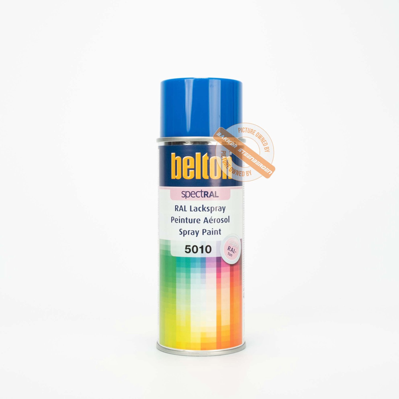
Belton RAL 5010 blue spray paint, product code 324081.

Brown colors bring warmth, stability and a sense of naturalness to any environment.
In the world of spray paint, RAL colors are an indispensable standard, loved for their consistency and reliability.
With a wide range of brown RAL shades, choosing the right color for your project can be a challenge.
In this blog, we’ll dive into the various brown RAL colors, their unique characteristics and similarities.
Not only will this help you make the right color choice, but it will also ensure that your shop is better found on search terms with RAL color codes.

The Meaning of Brown in Designs

Brown is a color often associated with earth, nature and warmth.
It brings a sense of stability and security, and can be both soothing and inviting.
Brown is versatile and can be used in both modern and traditional designs.
It can give a space a cozy and comfortable atmosphere while exuding a sense of elegance and sophistication.

Overview of Brown RAL Colors

Here are some of the most popular brown RAL colors you can find in our range of spray paint:

RAL 8001: Ochre brown

RAL 8001, Ochre Brown, is a warm and deep brown shade with yellow undertones.
This color exudes a sense of natural warmth and coziness and is ideal for use in both indoor and outdoor applications.

RAL 8002: Signal brown

RAL 8002, Signal Brown, is a rich and full brown shade reminiscent of the color of cocoa.
This color exudes strength and depth and is perfect for use in both residential and commercial environments.

RAL 8003: Loam brown

RAL 8003, Loam Brown, is an earthy and warm brown shade with red undertones.
This color exudes a sense of tranquility and naturalness and is ideal for use in natural and rustic designs.

RAL 8004: Copper brown

RAL 8004, Copper Brown, is a deep and rich brown shade with copper undertones.
This color exudes luxury and warmth and is perfect for use in chic and sophisticated interiors.

RAL 8007: Reddish brown

RAL 8007, Reebruin, is a warm and natural brown shade reminiscent of the color of deer fur.
This color exudes a sense of tranquility and naturalness and is ideal for use in rustic and country designs.

RAL 8011: Nut brown

RAL 8011, Note Brown, is a deep and rich brown shade reminiscent of the color of walnut.
This color exudes luxury and elegance and is perfect for use in classic and sophisticated interiors.

RAL 8012: Red brown

RAL 8012, Red Brown, is a deep and full brown shade with red undertones.
This color exudes warmth and depth and is ideal for use in both residential and commercial environments.

RAL 8014: Sepia brown

RAL 8014, Sepia Brown, is a dark and rich brown shade reminiscent of the color of sepia ink.
This color exudes elegance and sophistication and is perfect for use in chic and classic interiors.

RAL 8015: Chestnut brown

RAL 8015, Chestnut Brown, is a warm and deep brown shade reminiscent of the color of chestnuts.
This color exudes a sense of coziness and warmth and is ideal for use in both indoor and outdoor applications.

RAL 8016: Mahogany brown

RAL 8016, Mahoni Brown, is a deep and rich brown shade reminiscent of the color of mahogany.
This color exudes luxury and elegance and is perfect for use in chic and sophisticated interiors.

RAL 8017: Chocolate Brown

RAL 8017, Chocolate Brown, is a deep and full brown shade reminiscent of the color of dark chocolate.
This color exudes warmth and depth and is ideal for use in both residential and commercial environments.

RAL 8019: Gray Brown

RAL 8019, Gray Brown, is a subtle and neutral brown shade with gray undertones.
This color exudes a sense of calm and neutrality and is perfect for use in both interior and exterior applications.

RAL 8023: Orange-brown

RAL 8023, Orange Brown, is a warm and vibrant brown shade with orange undertones.
This color exudes energy and warmth and is ideal for use in both decorative and functional applications.

RAL 8024: Beige brown

RAL 8024, Beige Brown, is a soft and subtle brown shade with beige undertones.
This color exudes a sense of calm and neutrality and is perfect for use in both residential and commercial environments.

RAL 8025: Pearl brown

RAL 8025, Pearl Brown, is a rich and full brown shade with a pearlescent sheen.
This color exudes luxury and elegance and is ideal for use in chic and sophisticated interiors.

RAL 8028: Terra brown

RAL 8028, Terra Brown, is a deep and earthy brown shade reminiscent of the color of terracotta.
This color exudes a sense of tranquility and naturalness and is perfect for use in rustic and country designs.

Similarities and Differences

Although all of the above RAL colors are in the brown spectrum, each has unique characteristics that make them suitable for different applications. Here are some similarities and differences that can help you make the right choice:

Agreements:

  • Warmth: All brown RAL colors exude a sense of warmth and coziness.
  • Versatility: These colors can be used in a variety of environments, from rustic designs to modern interiors.
  • Consistency: RAL colors are known for their consistency, which means you will always get the same color regardless of the batch.

Differences:

  • Hue: Some colors have a red, yellow or gray undertone, while others tend more toward a deep, rich brown hue.
  • Scope: Brighter colors are often used for decorative purposes, while darker shades are ideal for classic and sophisticated interiors.
  • Appearance: Softer shades can create a sense of calm and neutrality, while deeper shades convey a sense of luxury and elegance.

How to Choose the Right Brown RAL Color

When choosing the right brown RAL color for your project, it is important to consider the purpose of the color and the environment in which it will be used. Here are some tips to help you choose:

  1. Identify the Purpose: Determine whether the color should be decorative or functional. For rustic and rural designs, warm shades such as RAL 8007 (Re brown) and RAL 8028 (Terra brown) are suitable, while softer shades such as RAL 8024 (Beige brown) are ideal for neutral environments.
  2. Consider the Environment: Consider the environment in which the color will be used. Warmer, richer colors are perfect for cozy and inviting spaces, while softer hues are suitable for calming and relaxing environments.
  3. Test the Color: If possible, test a small amount of the chosen color on the intended surface to see how the color looks under different lighting conditions and in combination with other elements in the room.

Conclusion

Brown RAL colors offer a wide range of possibilities for different applications, from rustic designs to modern interiors.
By understanding the unique characteristics of each hue and considering the specific needs of your project, you can choose the perfect brown RAL color that brings your vision to life.
Visit our online store for a wide selection of spray paint in all available RAL colors and be inspired by the versatility and beauty of brown.

Discover the Different Black RAL Colors for Spray Paint

Belton RAL 9010 matte white spray paint can.

Black colors add a sense of elegance, depth and modernity to any room or design.
In the world of spray paint, RAL colors are an indispensable standard, loved for their consistency and reliability.
With a wide range of black RAL shades, choosing the right color for your project can be a challenge.
In this blog, we’ll dive into the various black RAL colors, their unique properties and similarities.
Not only will this help you make the right color choice, but it will also ensure that your shop is better found on search terms with RAL color codes.

The Meaning of Black in Designs

Black is often associated with strength, elegance and sophistication.
It can add depth and contrast to a design and give a sense of luxury and modernity.
Black is versatile and can be used in both modern and traditional designs.
It can give a space a sleek and sophisticated look, while creating a sense of mystery and drama.

Overview of Black RAL Colors

Here are some of the most popular black RAL colors you can find in our range of spray paint:

RAL 5004: Black blue

RAL 5004, Black Blue, is a deep and mysterious hue that combines black and blue.
This color exudes a sense of elegance and depth, ideal for use in both interior and exterior applications where a subtle color change is desired.

RAL 7021: Black Gray

RAL 7021, Black Gray, is a dark, muted hue that blends gray and black.
This color exudes a sense of strength and modernity, perfect for use in industrial and architectural designs.

RAL 9004: Signal black

RAL 9004, Signal Black, is a pure and deep black shade.
This color exudes strength and elegance and is suitable for a wide range of applications, from vehicles to furniture.

RAL 9005: Jet black

RAL 9005, Jet Black, is one of the deepest and darkest shades of black available.
This color exudes a sense of luxury and sophistication, ideal for both interior and exterior applications where a powerful appearance is desired.

RAL 9011: Graphite black

RAL 9011, Graphite Black, is a rich and full-bodied shade of black with a slight graphite undertone.
This color exudes a sense of modernity and strength, perfect for use in contemporary and industrial designs.

RAL 9017: Traffic Black

RAL 9017, Traffic Black, is a versatile and neutral black shade.
This color is often used for traffic and safety applications, but is also suitable for a wide range of decorative applications.

Similarities and Differences

Although all of the above RAL colors are in the black spectrum, each has unique characteristics that make them suitable for different applications. Here are some similarities and differences that can help you make the right choice:

Agreements:

  • Depth: All black RAL colors exude a sense of depth and strength.
  • Versatility: These colors can be used in a variety of environments, from modern interiors to industrial applications.
  • Consistency: RAL colors are known for their consistency, which means you will always get the same color regardless of the batch.

Differences:

  • Hue: Some colors have a blue, gray or graphite-like undertone, while others tend more toward a pure and deep shade of black.
  • Scope: Black-blue and black-gray tones are often used for subtle and sophisticated designs, while pure black tones are ideal for powerful and dramatic effects.
  • Appearance: Neutral shades such as RAL 9017 (Traffic Black) can create a sense of versatility and neutrality, while richer shades such as RAL 9005 (Jet Black) convey a sense of luxury and sophistication.

How to Choose the Right Black RAL Color

When choosing the right black RAL color for your project, it is important to consider the purpose of the color and the environment in which it will be used. Here are some tips to help you choose:

1.Identify the Purpose: Determine whether the color should be decorative or functional.
For subtle and sophisticated designs, colors such as RAL 5004 (Black Blue) and RAL 7021 (Black Gray) are appropriate, while pure black tones such as RAL 9005 (Jet Black) are ideal for powerful and dramatic effects.
2.Consider the Environment: Consider the environment in which the color will be used.
Black-blue and black-gray shades are perfect for modern and industrial environments, while pure black tones are suitable for both indoor and outdoor applications.
3.Test the Color: If possible, test a small amount of the chosen color on the intended surface to see how the color looks under different lighting conditions and in combination with other elements in the room.

Conclusion

Black RAL colors offer a wide range of possibilities for different applications, from modern interiors to industrial designs.
By understanding the unique characteristics of each hue and considering the specific needs of your project, you can choose the perfect black RAL color that brings your vision to life.
Visit our webshop for a wide selection of spray paint cans in all available RAL colors and be inspired by the versatility and beauty of black.

Discover the Different Green RAL Colors for Spray Paint

Belton RAL 5010 blue spray paint, product code 324081.

Green colors exude nature, freshness and harmony.
In the world of spray paint, RAL colors are a standard and are often chosen for their consistency and reliability.
However, with so many different green RAL shades available, it can be confusing to choose the right one for your project.
In this blog, we will explore the different green RAL colors, explain their unique characteristics and discuss similarities between them.
Not only will this help you choose the perfect color, but it will also ensure that your shop is better found on search terms with RAL color codes.

The Meaning of Green in Designs

Before we delve deeper into the specific RAL colors, it is important to understand why green is such a powerful color in design and decoration.
Green is often associated with nature, growth and balance.
It can make a space vibrant and refreshing and create a sense of calm and well-being.
In the psychology of colors, green also represents stability and confidence, making it an excellent choice for both residential and commercial environments.

Overview of Green RAL Colors

Here are some of the most popular green RAL colors you can find in our range of spray paint:

RAL 6000: Patina green

RAL 6000, Patina Green, is a soft and subtle shade of green with a hint of blue.
This color exudes a sense of tranquility and sophistication and is ideal for use in both decorative and industrial applications.

RAL 6001: emerald green

RAL 6001, Emerald Green, is a deep and rich green reminiscent of the color of emeralds.
This color exudes luxury and depth and is perfect for decorative projects where an intense green hue is desired.

RAL 6002: Leaf green

RAL 6002, Leaf Green, is a bright and vibrant green hue reminiscent of the color of leaves.
This color exudes freshness and energy and is ideal for use in garden and landscape designs.

RAL 6003: Olive green

RAL 6003, Olive Green, is a warm and earthy green shade reminiscent of the color of olives.
This color exudes a sense of tranquility and naturalness and is perfect for use in natural and rustic designs.

RAL 6004: Blue green

RAL 6004, Blue Green, is a deep and intense green color with blue undertones.
This color exudes a sense of tranquility and mystery and is ideal for use in both residential and commercial applications.

RAL 6005: Moss green

RAL 6005, Moss Green, is a dark and rich green hue reminiscent of the color of moss.
This color exudes a sense of tranquility and naturalness and is perfect for use in garden designs and natural environments.

RAL 6006: Gray olive green

RAL 6006, Gray Olive Green, is an earthy and subtle shade of green with gray undertones.
This color exudes a sense of sophistication and tranquility and is ideal for use in natural and rustic designs.

RAL 6007: Bottle green

RAL 6007, Bottle Green, is a deep and dark green reminiscent of the color of wine bottles.
This color exudes a sense of luxury and depth and is perfect for use in both decorative and industrial applications.

RAL 6009: Pine green

RAL 6009, Pine Green, is a dark and rich green hue reminiscent of the color of pine trees.
This color exudes a sense of tranquility and naturalness and is ideal for use in natural and rustic designs.

RAL 6010: Grass green

RAL 6010, Grass Green, is a bright and vibrant green color reminiscent of the color of grass.
This color exudes freshness and energy and is perfect for use in garden and landscape designs.

RAL 6011: Reseda green

RAL 6011, Reseda Green, is a soft and subtle shade of green with gray undertones.
This color exudes a sense of tranquility and sophistication and is ideal for use in both decorative and industrial applications.

RAL 6012: Black green

RAL 6012, Black Green, is a deep and dark green that appears almost black.
This color exudes a sense of mystery and elegance and is perfect for use in modern and chic designs.

RAL 6013: Reed green

RAL 6013, Reed Green, is an earthy and subtle green hue reminiscent of the color of reeds.
This color exudes a sense of naturalness and tranquility and is ideal for use in natural and rustic designs.

RAL 6014: Yellow olive green

RAL 6014, Yellow Olive Green, is a warm and earthy green hue with yellow undertones.
This color exudes a sense of naturalness and tranquility and is perfect for use in both residential and commercial applications.

RAL 6016: Turquoise Green

RAL 6016, Turquoise Green, is a bright and vibrant green shade with blue undertones.
This color exudes freshness and vibrancy and is perfect for use in modern and creative designs.

RAL 6017: Mayan green

RAL 6017, Mayan Green, is a bright and vibrant green reminiscent of the color of jungle trees.
This color exudes a sense of freshness and energy and is ideal for use in garden and landscape designs.

RAL 6018: Yellow Green

RAL 6018, Yellow Green, is a bright and striking green color with yellow undertones.
This color exudes a sense of freshness and energy and is perfect for use in both decorative and industrial applications.

RAL 6019: Pastel Green

RAL 6019, Pastel Green, is a soft and delicate green hue that exudes a sense of tranquility and subtlety.
This color is ideal for use in soothing and relaxing interior designs.

RAL 6020: Chrome Green

RAL 6020, Chrome Green, is a deep and dark green reminiscent of the color of chromium oxide.
This color exudes a sense of strength and durability and is perfect for use in industrial applications.

RAL 6021: Pale Green

RAL 6021, Pale Green, is a soft and subtle green hue that exudes a sense of calm and serenity.
This color is ideal for use in soothing and relaxing interior designs.

RAL 6024: Traffic green

RAL 6024, Traffic Green, is a bright and vibrant green color often used for traffic signs and road markings.
This color provides maximum visibility and safety and is ideal for use in road construction and traffic management.

RAL 6025: Fern hat green

RAL 6025, Fern Hat Green, is a rich and natural green reminiscent of the color of ferns.
This color exudes a sense of tranquility and naturalness and is perfect for use in garden and landscape designs.

RAL 6026: Opalite green

RAL 6026, Opalite Green, is a deep and intense green reminiscent of the color of opalite.
This color exudes luxury and sophistication and is ideal for use in both decorative and industrial applications.

RAL 6027: Light green

RAL 6027, Light Green, is a soft and delicate green hue that exudes a sense of calm and serenity.
This color is ideal for use in soothing and relaxing interior designs.

RAL 6028: Pine green

RAL 6028, Pine Green, is a deep and rich green reminiscent of the color of pine trees.
This color exudes a sense of tranquility and naturalness and is ideal for use in natural and rustic designs.

RAL 6029: Mint green

RAL 6029, Mint Green, is a bright and vibrant green shade reminiscent of the color of mint leaves.
This color exudes freshness and vibrancy and is perfect for use in modern and creative designs.

RAL 6029: Mint green

RAL 6029, Mint Green, is a bright and vibrant green shade reminiscent of the color of mint leaves.
This color exudes freshness and vibrancy and is perfect for use in modern and creative designs.

RAL 6032: Signal green

RAL 6032, Signal Green, is a very bright and striking green color often used for traffic signs and safety markings.
This color offers maximum visibility and attracts immediate attention.

RAL 6033: Mint turquoise

RAL 6033, Mint Turquoise, is a bright and vibrant green shade with blue undertones.
This color exudes freshness and vibrancy and is perfect for use in modern and creative designs.

RAL 6034: Pastel turquoise

RAL 6034, Pastel Turquoise, is a soft and delicate green shade with blue undertones.
This color exudes a sense of calm and serenity and is ideal for use in soothing and relaxing interior designs.

Similarities and Differences

Although all of the above RAL colors are in the green spectrum, each has unique characteristics that make them suitable for different applications. Here are some similarities and differences that can help you make the right choice:

Agreements:

  • Naturalness: All green RAL colors exude a sense of nature and freshness.
  • Versatility: These colors can be used in a variety of environments, from soothing interiors to eye-catching road signs.
  • Consistency: RAL colors are known for their consistency, which means you will always get the same color regardless of the batch.

Differences:

  • Hue: Some colors have a blue or yellow undertone, while others tend more toward a bright green hue.
  • Scope: Brighter colors are often used for signaling and security applications, while darker shades are ideal for decorative and interior applications.
  • Appearance: Softer shades can create a sense of serenity and calm, while brighter shades exude a sense of freshness and vibrancy.

How to Choose the Correct Green RAL Color

When choosing the right green RAL color for your project, it is important to consider the purpose of the color and the environment in which it will be used. Here are some tips to help you choose:

  1. Identify the Purpose:Determine whether the color should be decorative or functional. For signage and safety applications, bright colors such as RAL 6024 (Traffic Green) and RAL 6032 (Signal Green) are suitable, while softer shades such as RAL 6027 (Light Green) are ideal for recreational areas.
  2. Consider the Environment:Consider the environment in which the color will be used. Brighter, vibrant colors are perfect for modern and creative environments, while softer hues are suitable for calming and relaxing spaces.
  3. Test the Color:If possible, test a small amount of the chosen color on the intended surface to see how the color looks under different lighting conditions and in combination with other elements in the room.

Conclusion

Green RAL colors offer a wide range of possibilities for different applications, from industrial safety to interior design.
By understanding the unique characteristics of each hue and considering the specific needs of your project, you can choose the perfect green RAL color that brings your vision to life.
Visit our online store for a wide selection of spray paint in all available RAL colors and be inspired by the versatility and beauty of green.

 RAL vs. Pantone: Begrijp de Kleurensystemen voor Spuitbussen

When choosing the perfect color for your spray paint project, two important color systems stand out: RAL and Pantone. These color standards are widely used in various industries, including paint production, graphic design, and product branding. Understanding the differences and similarities between RAL and Pantone can help you make an informed choice for your next project. In this blog, we will detail the RAL Color Systems and Pantone Color Systems, discuss their applications, and provide some useful comparisons to help you choose the right color for your needs.

Het Ral-Kleurensystemen Voor Spuitbussen

eschiedenis en Oorsprong

Het Ral-Kleurensystemen werd ontwikkeld in Duitsland in 1927 en wordt beheerd door het RAL Deutsches Institut für Gütesicherung und Kennzeichnung e.V. Het systeem werd aanvankelijk gecreëerd om kleurkeuzes te standaardiseren voor industrieën zoals architectuur, bouw en productie. Tegenwoordig worden RAL-kleuren wereldwijd gebruikt voor een breed scala aan toepassingen.

Structuur en Toepassing

Ral-Kleurensystemen staan bekend om hun eenvoud en betrouwbaarheid. Elke kleur in het RAL-systeem krijgt een unieke viercijferige code. Bijvoorbeeld, RAL 9010 is een populaire tint wit. Deze eenvoudige codering maakt het gemakkelijk om specifieke kleuren te identificeren en te reproduceren, wat essentieel is voor industriële en commerciële toepassingen.

Populaire Gebruiksgebieden

  • Industrieel Ontwerp: Van voertuigen tot machines, RAL-kleuren zorgen voor consistentie en duurzaamheid.
  • Architectuur: Gebouwen en structuren maken vaak gebruik van RAL-kleuren voor esthetische en functionele redenen.
  • Interieurontwerp: Veel interieurelementen, zoals meubels en accessoires, worden vervaardigd in RAL-kleuren.

Het Pantone Kleurensysteem

Geschiedenis en Oorsprong

Het Pantone Matching System (PMS) werd ontwikkeld door het Amerikaanse bedrijf Pantone Inc. in de jaren zestig. Pantone heeft sindsdien een wereldwijde reputatie opgebouwd als dé standaard voor kleurnauwkeurigheid in de druk- en ontwerpindustrie.

Structuur en Toepassing

Pantone-kleuren zijn genummerd en soms voorzien van letters om varianten aan te duiden. Bijvoorbeeld, Pantone 186 C is een specifieke tint rood. In tegenstelling tot RAL, dat voornamelijk wordt gebruikt in industriële toepassingen, is Pantone vooral bekend in de grafische wereld, mode, interieurontwerp en branding.

Populaire Gebruiksgebieden

  • Grafisch Ontwerp en Drukwerk: Pantone-kleuren zorgen voor consistente kleurweergave in drukwerk.
  • Mode en Textiel: Ontwerpers gebruiken Pantone-kleuren om seizoensgebonden trends te creëren.
  • Productbranding: Merken vertrouwen op Pantone om hun huisstijlkleuren consistent te houden.

Verschillen Tussen RAL en Pantone

Doel en Gebruik

  • RAL: Voornamelijk gebruikt in industriële en bouwtoepassingen.
  • Pantone: Voornamelijk gebruikt in grafisch ontwerp, mode en branding.

Kleurcodering

  • RAL: Viercijferige codes (bijvoorbeeld RAL 3020).
  • Pantone: Alfanumerieke codes (bijvoorbeeld Pantone 186 C).

Toepassingsgebieden

  • RAL:  Beter geschikt voor verf, coatings en industriële materialen.
  • Pantone: Ideaal voor drukwerk, textiel en digitale media.

Overeenkomsten Tussen Ral-Kleurensystemen en Pantone Kleurensystemen

Hoewel RAL en Pantone verschillende doelen en toepassingen hebben, zijn er enkele overeenkomsten:

  • Kleurconsistentie: Beide systemen bieden betrouwbare en consistente kleurreferenties.
  • Standaardisatie: Zowel RAL als Pantone zorgen voor een gestandaardiseerde benadering van kleur, wat cruciaal is voor professionele toepassingen.
  • Breed Kleurengamma:  Beide systemen bieden een uitgebreide selectie kleuren om aan diverse behoeften te voldoen.

RAL en Pantone Kleuren Vergelijken

Hoewel er geen directe één-op-één overeenkomsten zijn tussen RAL en Pantone-kleuren vanwege de verschillende manieren waarop kleuren worden samengesteld en gemeten, zijn er tools en tabellen beschikbaar die helpen bij het vinden van de dichtstbijzijnde matches tussen de twee systemen. Hieronder enkele voorbeelden:

  • RAL 3020 (Verkeersrood) vs. Pantone 485 C: Beide zijn levendige, krachtige rode tinten die vaak gebruikt worden voor opvallende toepassingen.
  • RAL 5015 (Hemelsblauw) vs. Pantone 285 C: Helder blauw, populair in zowel industriële als grafische toepassingen.
  • RAL 9010 (Zuiver Wit) vs. Pantone 11-0601 TCX (Bright White): Zuivere wittinten die zorgen voor een frisse en schone uitstraling.

Conclusie

Zowel RAL als Pantone bieden waardevolle oplossingen voor kleurstandaardisatie, elk met hun eigen unieke voordelen en toepassingsgebieden. Door de verschillen en overeenkomsten tussen deze systemen te begrijpen, kun je beter beslissen welke kleur het beste past bij jouw specifieke projectbehoeften. Of je nu werkt aan een industriële toepassing, een grafisch ontwerp of productbranding, Ral-Kleurensystemen en Pantone Kleurensystemen bieden de consistentie en kwaliteit die nodig zijn om je project tot een succes te maken.

Bij het kiezen van spuitbusverf voor jouw project, overweeg dan niet alleen de kleur maar ook het kleurensysteem dat het beste aansluit bij jouw behoeften. Zo kun je er zeker van zijn dat je de perfecte kleur en afwerking krijgt, elke keer weer.

Discover the Different Red RAL Colors for Spray Paint

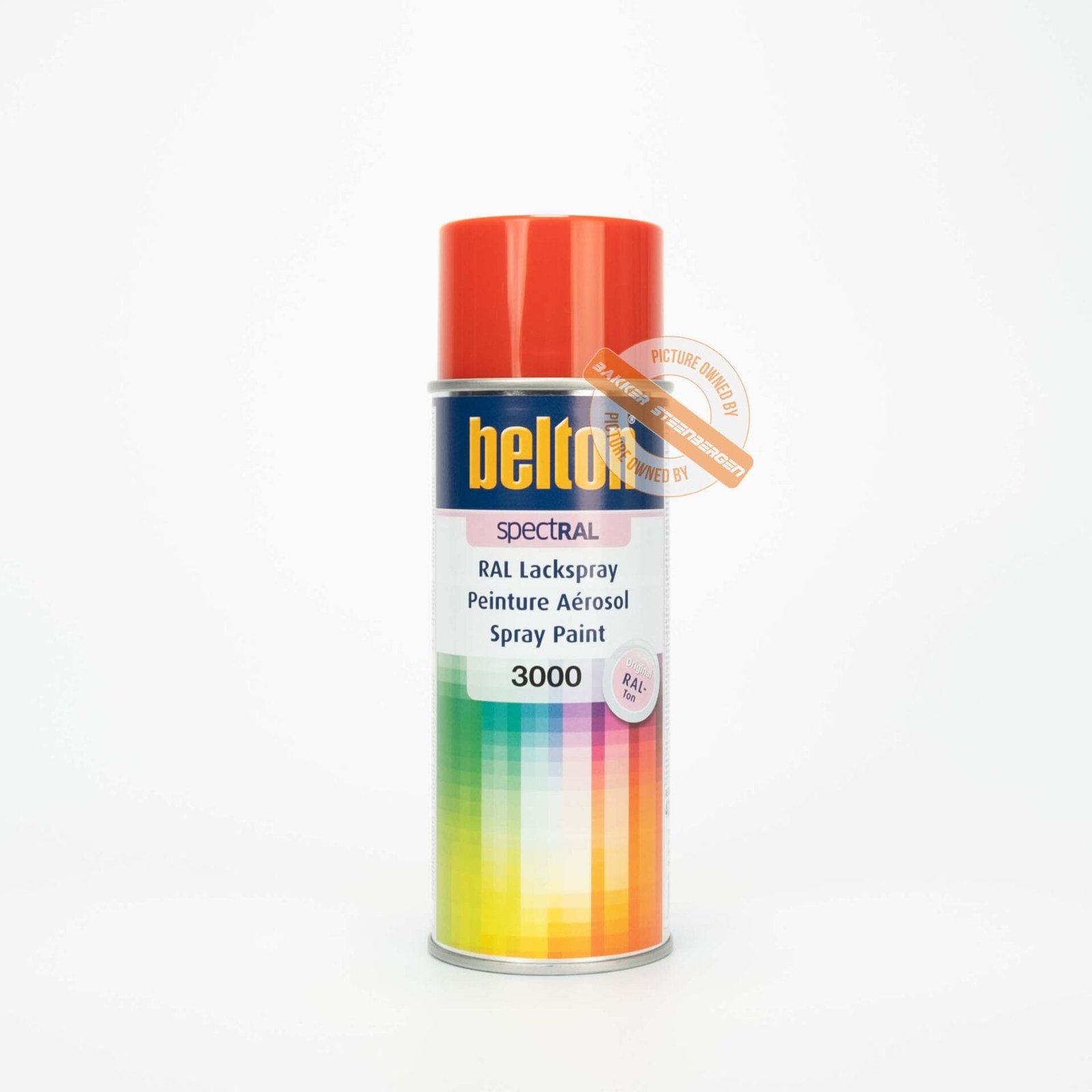
Red Belton spray paint, RAL 3000, product code 324040.

Red colors exude power, passion and dynamism. In the world of spray paint, RAL colors are a standard and are often chosen for their consistency and reliability. However, with so many different Red RAL colors available, it can be confusing to choose the right one for your project. In this blog, we will explain the different red colors for aerosol paint, their unique characteristics and discuss similarities between them. Not only will this help you choose the perfect color, but it will also ensure that your shop is better found on search terms with RAL color codes.

The Meaning of Red Colors in Designs

Before we delve deeper into the specific RAL colors, it is important to understand why red is such a powerful color in design and decoration. Red is often associated with energy, power and passion. It can warm up a space and create a sense of urgency and excitement. In the psychology of colors, red also represents courage and action, making it an excellent choice for dynamic and stimulating environments.

Overview of Red Ral Colors

Here are some of the most popular Red Ral Colors you can find in our range of spray paint:

RAL 3000: Fire red

RAL 3000, Fire Red, is a bright and intense red hue that exudes a sense of energy and warmth. This color is often used in applications where a powerful visual impact is desired.

RAL 3002: Crimson red

RAL 3002, Crimson Red, is a deep and rich red that tends to a slightly darker shade. This color exudes elegance and sophistication and is ideal for both decorative and industrial applications.

RAL 3003: Ruby red

RAL 3003, Ruby Red, is a very deep and intense red color reminiscent of the color of rubies. This luxurious color is perfect for decorative projects where a rich and striking red hue is desired.

RAL 3004: Purple red

RAL 3004, Purple Red, is a dark red color with a hint of purple. This color exudes a sense of depth and richness and is ideal for classic and sophisticated applications.

RAL 3005: Wine red

RAL 3005, Wine Red, is a deep, dark red color reminiscent of the color of red wine. This color is perfect for use in both residential and commercial applications where a warm and inviting red hue is desired.

RAL 3007: Black red

RAL 3007, Black Red, is a very dark shade of red that appears almost black. This color exudes a sense of mystery and elegance and is ideal for use in modern and chic designs.

RAL 3009: Oxide red

RAL 3009, Oxide Red, is a deep, earthy red reminiscent of the color of rust. This color is perfect for use in both industrial and decorative applications where a natural and robust red hue is desired.

RAL 3012: beige red

RAL 3012, Beige Red, is a soft, light red hue with a hint of beige. This color exudes a sense of rust and subtlety and is ideal for use in interior designs where a delicate red hue is desired.

RAL 3013: Tomato red

RAL 3013, Tomato Red, is a bright and vibrant red color reminiscent of the color of ripe tomatoes. This color exudes freshness and energy and is perfect for both indoor and outdoor applications.

RAL 3014: Old pink

RAL 3014, Old Pink, is a soft, pinkish red reminiscent of the color of old pink. This color is ideal for use in romantic and classic interior designs.

RAL 3015: Light pink

RAL 3015, Light Pink, is a very light and delicate red shade that appears almost pink. This color exudes a sense of softness and sophistication and is perfect for use in subtle and elegant designs.

RAL 3016: Coral red

RAL 3016, Coral Red, is a vibrant and energetic red hue reminiscent of the color of coral. This color exudes a sense of freshness and vitality and is ideal for use in modern and creative designs.

RAL 3020: Traffic Red

RAL 3020, Traffic Red, is a very bright and striking red color often used for traffic signs and safety markings. This color offers maximum visibility and attracts immediate attention.

RAL 3027: Raspberry red

RAL 3027, Raspberry Red, is a bright and vibrant red color reminiscent of the color of raspberries. This color exudes a sense of freshness and energy and is perfect for use in decorative applications.

Similarities and Differences

Although all of the above RAL colors are in the red spectrum, each has unique characteristics that make them suitable for different applications. Here are some similarities and differences that can help you make the right choice:

Agreements

  • Strength: All Red Ral colors exude a sense of strength and energy.
  • Versatility: These colors can be used in a variety of environments, from industrial to residential.
  • Consistency: RAL colors are known for their consistency, which means you will always get the same color regardless of the batch.

Differences:

  • Brightness: Some colors such as RAL 3020 (Traffic Red) and RAL 3013 (Tomato Red) are much brighter and more striking than softer shades such as RAL 3012 (Beige Red) and RAL 3015 (Light Pink).
  • Scope: Brighter colors are often used for security and signage, while softer shades are ideal for decorative and interior applications.
  • Undertones: Colors such as RAL 3004 have a purple undertone, while RAL 3005 has a wine-like undertone, which creates a different visual effect.

How to Choose the Right Red Ral Colors

When choosing the right Red Ral Colors for your project, it is important to consider the purpose of the color and the environment in which it will be used. Here are some tips to help you choose the different Red Ral Colors for spray paint:

  1. Identify Purpose: Determine whether the color should be decorative or functional. For security applications, bright colors such as RAL 3020 and RAL 3013 are suitable, while for interiors, softer shades such as RAL 3014 are better.
  2. Consider the Environment: Consider the environment in which the color will be used. Warm, deep shades such as RAL 3005 are perfect for residential spaces, while brighter shades are ideal for industrial environments.
  3. Test the Color: If possible, test a small amount of the chosen color on the intended surface to see how the color looks under different lighting conditions.

Conclusion

The Different Red Ral Colors For Spray Paint offer a wide range of possibilities for different applications, from industrial safety to interior design. By understanding the unique characteristics of each hue and considering the specific needs of your project, you can choose the perfect Red Ral Colors that bring your vision to life. Visit our webshop for a wide selection of spray paint cans in all available RAL colors and be inspired by the versatility and beauty of red.

Discover the Different Purple Ral Colors for Spray Paint

purple RAL colors exude luxury, creativity and mystery. In the world of spray paint, RAL colors are a standard and are often chosen for their consistency and reliability. However, with so many different purple RAL shades available, it can be confusing to choose the right one for your project. In this blog, we will discuss the different Purple RAL colors explore, explain their unique characteristics and discuss similarities between these colors. This will not only help you choose the perfect color, but also ensure that your shop will be better found on search terms with RAL color codes.

The Meaning of Purple in Designs

Before we delve deeper into the specific RAL colors, it is important to understand why purple is such a powerful color in design and decoration. purple ral colors is often associated with luxury, spirituality and creativity. It can give a space a sense of depth and richness and create a creative and inspiring atmosphere. In the psychology of colors, purple also represents mystery and magic, making it an excellent choice for unique and artistic environments.

Overview of Purple Ral Colors

Here are some of the most popular purple RAL colors you can find in our range of spray paint:

RAL 4001: red lilac

RAL 4001, Red Lilac, is a soft and delicate purple hue with a hint of red. This color exudes elegance and sophistication and is ideal for use in interior designs where a subtle purple hue is desired.

RAL 4003: Heather red

RAL 4003, Heather Red, is a bright and vibrant purple color with pink undertones. This color exudes a sense of freshness and energy and is perfect for modern and decorative applications.

RAL 4004: Burgundy purple

RAL 4004, Burgundy Purple, is a deep, rich Purple Ral color with a hint of red. This color exudes luxury and depth and is ideal for both residential and commercial applications where a strong purple hue is desired.

RAL 4005: Blue purple

RAL 4005, Blue Purple, is a cool and serene purple hue with blue undertones. This color exudes a sense of rust and sophistication and is perfect for use in both interior and exterior designs.

RAL 4006: Traffic track

RAL 4006, Traffic Purple, is a very bright and striking purple color with red undertones. This color offers maximum visibility and attracts immediate attention, making it ideal for signage and safety applications.

RAL 4007: purple violet

RAL 4007, Purple Violet, is a deep and dark purple hue with a hint of black. This color exudes a sense of mystery and elegance and is ideal for use in chic and modern designs.

RAL 4008: Signal violet

RAL 4008, Signal Violet, is a vibrant purple color with a bright, striking hue. This color exudes creativity and energy and is perfect for use in artistic and decorative applications.

RAL 4010: Telemagenta

RAL 4010, Telemagenta, is a very vibrant and striking purple hue with strong pink undertones. This color offers a sense of playfulness and energy and is ideal for use in modern and creative environments.

Similarities and Differences

Although all of the above RAL colors are in the purple spectrum, each has unique characteristics that make them suitable for different applications. Here are some similarities and differences that can help you make the right choice:

Agreements:

  • Luxury: All purple RAL colors exude a sense of luxury and depth.
  • Creativity: These colors can be used in different environments to create a creative and inspiring atmosphere.
  • Consistency: RAL colors are known for their consistency, which means you will always get the same color regardless of the batch.

Differences:

  • Brightness: Some colors such as RAL 4010 (Telemagenta) and RAL 4003 (Heather Red) are much brighter and more striking than softer shades such as RAL 4001 (Red Lilac) and RAL 4007 (Purple Violet).
  • Scope: Brighter colors are often used for signaling and security applications, while softer shades are ideal for decorative and interior applications.
  • Undertone: Colors such as RAL 4005 have a blue undertone, while RAL 4004 has a reddish undertone, which creates a different visual effect.

How to Choose the Right Purple Ral Colors

When choosing the right purple RAL color for your project, it is important to consider the purpose of the color and the environment in which it will be used. Here are some tips to help you choose:

  1. Identify Purpose: Determine whether the color should be decorative or functional. For security applications, bright colors such as RAL 4010 and RAL 4006 are suitable, while for interiors, softer shades such as RAL 4001 are better.
  2. Consider the Environment: Consider the environment in which the color will be used. Warm, deep shades such as RAL 4007 are perfect for residential spaces, while brighter shades are ideal for creative environments.
  3. Test the Color: If possible, test a small amount of the chosen color on the intended surface to see how the color looks under different lighting conditions.

Conclusion

Purple Ral colors offer a wide range of possibilities for different applications, from industrial safety to interior design. By understanding the unique characteristics of each hue and considering the specific needs of your project, you can choose the perfect Purple Ral colors that bring your vision to life. Visit our online store for a wide selection of spray paint in all available RAL colors and be inspired by the versatility and beauty of purple.

Discover the Different Orange RAL Colors for Spray Paint

Orange colors exude energy, warmth and creativity. In the world of spray paint, RAL colors are a standard and are often chosen for their consistency and reliability. However, with so many different Orange RAL shades available, it can be confusing to choose the right one for your project. In this blog, we will explore the different Orange RAL Colors, explain their unique characteristics and discuss similarities between them. Not only will this help you choose the perfect color, but it will also ensure that your shop is better found on search terms with RAL color codes.

The Meaning of Orange in Designs

Before we delve deeper into the specific Ral colors, it is important to understand why orange is such a powerful color in design and decoration. Orange is often associated with energy, enthusiasm and warmth. It can brighten a space and create a sense of coziness and creativity. In the psychology of colors, orange also represents motivation and stimulation, making it an excellent choice for workspaces and creative environments.

Overview of Orange Ral Colors

Here are some of the most popular Orange Ral Colors you can find in our range of spray paint:

RAL 2000: Yellow-orange

RAL 2000, Yellow Orange, is a bright and vibrant orange hue with distinct yellow undertones. This color exudes warmth and energy and is ideal for use in environments where a stimulating and cheerful atmosphere is desired.

RAL 2001: Red orange

RAL 2001, Red Orange, is a deep and rich orange shade with red undertones. This color exudes power and passion and is often used in industrial and decorative applications where a striking color is desired.

RAL 2002: Vermilion

RAL 2002, Vermilion, is an intense orange color that tends toward red. It is a very striking and vibrant color that is perfect for applications where strong visual impact is desired.

RAL 2003: Pastel orange

RAL 2003, Pastel Orange, is a soft, light orange shade reminiscent of pastel crayons. This color is ideal for decorative applications where a subtle and inviting color is desired.

RAL 2004: Pure orange

RAL 2004, Pure Orange, is a very bright and saturated orange hue. This color is often used for safety markings and signage because of its high visibility and eye-catching nature.

RAL 2008: light rose

RAL 2008, Light Red Orange, is a bright and light orange shade with a hint of red. This color exudes a sense of freshness and energy and is perfect for modern designs and decorative applications.

RAL 2009: Traffic orange

RAL 2009, Traffic Orange, is a very bright and vibrant orange shade often used for traffic signs and safety markings. This color offers maximum visibility and attracts immediate attention.

RAL 2010: signal orange

RAL 2010, Signal Orange, is a deep and rich orange hue with red undertones. This color is often used for safety and signaling applications because of its striking and warning character.

RAL 2011: Deep orange

RAL 2011, Deep Orange, is an intense, deep orange color reminiscent of the color of autumn leaves. This color is perfect for decorative applications where a warm and inviting atmosphere is desired.

Similarities and Differences

Although all of the above RAL colors are in the orange spectrum, they each have their unique characteristics that make them suitable for different applications. Here are some similarities and differences that can help you make the right choice:

Agreements:

  • Energy: All orange RAL colors radiate a sense of energy and warmth.
  • Versatility: These colors can be used in a variety of environments, from industrial to residential.
  • Consistency: RAL colors are known for their consistency, which means you will always get the same color regardless of the batch.

Differences:

  • Brightness: Some colors such as RAL 2004 (Pure Orange) and RAL 2009 (Traffic Orange) are much brighter and more striking than softer shades such as RAL 2003 (Pastel Orange) and RAL 2011 (Deep Orange).
  • Scope: Brighter colors are often used for security and signage, while softer shades are ideal for decorative and interior applications.
  • Undertones: Colors such as RAL 2000 have a yellow undertone, while RAL 2001 has a red undertone, which creates a different visual effect.

How to Choose the Right Orange Ral Colors

When choosing the right Orange Ral colors for your project, it is important to consider the purpose of the color and the environment in which it will be used. Here are some tips to help you choose:

  1. Identify Purpose: Determine whether the color should be decorative or functional. For security applications, bright colors such as RAL 2004 and RAL 2009 are suitable, while for interiors, softer shades such as RAL 2003 are better.
  2. Consider the Environment: Consider the environment in which the color will be used. Warm, natural shades such as RAL 2011 are perfect for outdoor spaces, while brighter shades are ideal for industrial environments.
  3. Test the Color: If possible, test a small amount of the chosen color on the intended surface to see how the color looks under different lighting conditions.

Conclusion

Orange Ral Colors offer a wide range of possibilities for different applications, from industrial safety to interior design. By understanding the unique characteristics of each hue and considering the specific needs of your project, you can choose the perfect Orange Ral Colors that will bring your vision to life. Visit our webshop for a wide selection of spray paint cans in all available RAL colors and be inspired by the versatility and beauty of orange.

Discover the Different Yellow RAL Colors for Spray Paint

Belton RAL 1005 yellow spray paint, product code 324006.

Yellow colors often convey a sense of joy, energy and positivity. In the world of spray paint, RAL colors are a standard and are often chosen for their consistency and reliability. However, with so many different Yellow RAL colors available, it can be confusing to choose the right one for your project. In this blog, we will explore the different Yellow Ral Colors, explain their unique characteristics and discuss similarities between them. This will not only help you choose the perfect color, but also ensure that your shop will be better found on search terms with RAL color codes.

The Meaning of Yellow in Designs

Before we delve deeper into the specific RAL colors, it is important to understand why yellow is such a powerful color in design and decoration. Yellow is often associated with sunlight, happiness and optimism. It can brighten spaces and create a sense of warmth and comfort. In the psychology of colors, yellow also represents creativity and energy, making it an excellent choice for workspaces and creative environments.

Overview of Yellow RAL Colors

Here are some of the most popular Yellow Ral Colors you can find in our range of spray paint:

RAL 1001: Beige

RAL 1001, Beige, is a light yellowish color that tends toward a sandy hue. This color is very versatile and is often used in interiors for a warm, inviting atmosphere without being too bright.

RAL 1003: Signal yellow

RAL 1003, Signal Yellow, is a bright and vibrant yellow hue often used for safety and signage applications. This color stands out well and is often used to attract attention and mark warning signs.

RAL 1004: golden yellow

RAL 1004, Golden Yellow, has a rich, deep yellow hue reminiscent of the color of gold. It is a luxurious and striking color often used in decorative applications and to add a touch of glamour to a project.

RAL 1005: Honey yellow

RAL 1005, Honey Yellow, is a warm and sweet shade of yellow reminiscent of honey. This color brings warmth and coziness to any room and is perfect for both indoor and outdoor applications.

RAL 1006: Corn yellow

RAL 1006, Corn Yellow, is a deep, full yellow hue reminiscent of ripe corn. This color is ideal for use in both industrial applications and decorative projects where a rich yellow color is desired.

RAL 1007: Daffodil yellow

RAL 1007, Daffodil Yellow, is a vibrant, cheerful shade of yellow reminiscent of the bright yellow flowers of daffodils. This color brings a sense of spring and renewal and is perfect for outdoor spaces and garden decoration.

RAL 1011: Brown yellow

RAL 1011, Brown Yellow, is a muted yellow shade with brown undertones. This color is ideal for use in environments where a more subdued, earthy yellow tone is desired.

RAL 1012: lemon yellow

RAL 1012, Lemon Yellow, is a fresh and bright yellow hue reminiscent of the color of lemons. This color is perfect for adding a touch of freshness and energy to any room.

RAL 1013: Pearl white

RAL 1013, Pearl White, is a very light yellow shade that tends toward white. This color is ideal for creating a clean, fresh look without the sterile appearance of pure white.

RAL 1014: Ivory

RAL 1014, Ivory, is a soft, warm yellow shade reminiscent of the color of ivory. This color is perfect for adding a subtle warmth to interiors and decorative projects.

RAL 1015: Light ivory

RAL 1015, Light Ivory, is a lighter version of RAL 1014 and offers a delicate, warm yellow hue that is ideal for use in quiet, relaxing environments.

RAL 1016: sulfur yellow

RAL 1016, Sulphur Yellow, is a beautiful, striking shade of yellow that resembles the color of sulfur. This color is often used in safety and warning signs because of its high visibility.

RAL 1017: Saffron Yellow

RAL 1017, Saffron Yellow, is a rich, warm yellow shade reminiscent of the precious spice saffron. This color brings a sense of luxury and warmth and is perfect for decorative applications.

RAL 1018: Zinc yellow

RAL 1018, Zinc Yellow, is a yellow color that exudes energy and vibrancy. It is a popular choice for industrial applications and modern designs where a striking color is desired.

RAL 1019: Gray-beige

RAL 1019, Gray Beige, is a more subdued yellow hue with gray undertones. This color is perfect for use in subtle, modern interiors where a neutral but warm hue is desired.

RAL 1021: Rap signal yellow

RAL 1021, Rapssignal Yellow, is a very bright and vibrant shade of yellow often used for traffic signs and other safety markings. This color offers maximum visibility and attracts immediate attention.

RAL 1028: Melon yellow

RAL 1028, Melon Yellow, is a warm and inviting shade of yellow reminiscent of the color of a ripe melon. This color is perfect for use in both interior and exterior applications where a vibrant yellow hue is desired.

RAL 1032: Broomstick

RAL 1032, Broom Yellow, is a deep, rich yellow hue reminiscent of the color of broom. This color is ideal for use in both industrial and decorative applications where a bold yellow color is desired.

RAL 1033: Dahlie yellow

RAL 1033, Dahlie Yellow, is a warm, rich yellow hue reminiscent of the color of dahlia flowers. This color brings a sense of luxury and vibrancy to any room and is perfect for decorative projects.

Similarities and Differences

Although all of the above RAL colors are in the yellow spectrum, each has unique characteristics that make them suitable for different applications. Here are some similarities and differences that can help you make the right choice:

Agreements:

  • Warmth: All Yellow Ral colors radiate a sense of warmth and positivity.
  • Versatility: These colors can be used in a variety of environments, from industrial to residential.
  • Consistency: RAL colors are known for their consistency, which means you will always get the same color regardless of the batch.

Differences:

  • Brightness: Some colors such as RAL 1003 (Signal Yellow) are much brighter and more striking than softer shades such as RAL 1001 (Beige).
  • Scope: Brighter colors are often used for security and signage, while softer shades are ideal for decorative and interior applications.
  • Undertones: Colors such as RAL 1011 have a brownish undertone, while RAL 1004 has a golden undertone, which creates a different visual effect.

How to Choose the Correct Yellow RAL Color

When choosing the right Yellow Ral Colors for your project, it is important to consider the purpose of the color and the environment in which it will be used. Here are some tips to help you choose:

  1. Identify Purpose: Determine whether the color should be decorative or functional. For security applications, bright colors such as RAL 1003 and RAL 1023 are suitable, while for interiors, softer shades such as RAL 1001 are better.
  2. Consider the Environment: Consider the environment in which the color will be used. Warm, natural shades such as RAL 1002 and RAL 1005 are perfect for outdoor spaces, while brighter shades are ideal for industrial environments.
  3. Test the Color: If possible, test a small amount of the chosen color on the intended surface to see how the color looks under different lighting conditions.

Conclusion

Yellow Ral Colors offer a wide range of possibilities for different applications, from industrial safety to interior design. By understanding the unique characteristics of each hue and considering the specific needs of your project, you can choose the perfect Yellow Ral Colors that will bring your vision to life. Visit our online store for a wide selection of spray paint in all available RAL colors and be inspired by the versatility and beauty of yellow.